Marketing a museum has got to be one of the most difficult things to do. However, Libeskind’s designs and Gehry’s audaciousness coupled with Calatrava’s willingness to push architectural technology to limits never thought before can be a good incentive for thousands of people to visit museums, not for the art inside but for the awesome works of art enclaving the whole idea of a museum. Consequently, slowly by slowly we are seeing bold and intriguing forms being adopted for museums around the world; albeit a sign of how much architectural forms have become attraction magnets. The extension of the Denver Art Museum by architect Daniel Libeskind is one such building opening up the whole city to visitors in large numbers never thought of; unintentionally, the building’s architecture has become the strongest marketing for the Denver Art Museum.
It was Studio Libeskind’s first building to reach completion in the United States possibly because Libeskind’s architectural forms are never easy to build. They take years and sometimes overrun budgets. May be, the price to pay for bold designs like this one.
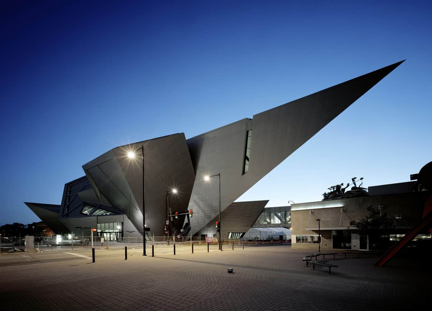
Inspired by the peaks and valleys of the surrounding Rocky Mountains, the architects designed an extension with a sharply angled cantilevered section that juts across the street, pointing towards the existing Denver Art museum that was designed by Italian architect from Milan, Gio Ponti, in 1971.
The new museum houses a collection of Oceanic and African Art in 13,564 square metres of space clad in 9,000 titanium panels covering the surface and reflecting the Collorado landscape. The geometric volumes in this design were part of the architect’s intention to compose a building that would be a public space, a monument and a gateway in a developing part of the city tying together downtown, the Civic Centre, and forming a strong connection to the golden triangle neighbourhood.
According to the architect, he did not want to rehash readymade ideas which would have seen a building that separates the interiors and exteriors or a pretty facade housing a typical experience behind it. The intention was to merge both, creating a design that would connect organically to the existing landscape while housing an intellectual, emotional and sensual experience inside.
Light, proportion and materiality were principle aspects in the design. To integrate these dimensions for the public to enjoy, a handcrafted nature of architecture approach had to be employed, connecting the spaces to the visitors’ hands, to the eyes and to the minds.
The interiors were crafted to relate to the function and aesthetic of the existing Ponti museum. One of the challenges mentioned by the architect was to respond to the extraordinary range of transformations in light, coloration, atmospheric effects, and temperature and weather conditions unique to the city of Denver. He insisted that all these factors would be integrated into the building, not just functionally and physically but culturally and experientially as well so the visitors would gain a lot from the experience of walking in the building.
The Acoma Plaza of the Arts is the museum’s ‘front yard’ filled with public art and acts as a stage for public events. The effects of this extension have been seen since its completion and unveiling in October 2006. Apart from the building pulling worldwide crowds who come to marvel on its architecture, the entire neighbourhood has felt positive effects leading to new museums and housing schemes joining Libeskind’s design on this amazing landscape.
Project information
Architects: Studio Libeskind
Lead Architect: Daniel Libeskind
Location: Denver, USA
Area: 13,564 sqm
Photography: Studio Libeskind

