Nature has taught our eyes to find matching colors more satisfying than clashing colors. That is why flowers look great, even for insects and birds. We evolved to like bright colors and even release dopamine whenever we look at a bright color like pink.
Pink alone is very attractive in all its shades. What makes pink more attractive is when you find different colors that go with pink and juxtapose the two together. Giving context to color makes it more attractive because there is ground for appreciation. For this reason, we will discuss all the colors that match pink.
Before we match colors with pink, we need to know the different shades of pink to match them correctly.
How Many Shades of Pink Are There?

image source: homestratosphere.com
While there are countless shades of pink, there are some color combinations with pink that you will find more attractive. Here are some combinations that will look best with different shades of pink.
Colors That Go With Pink
1) Pink and White

image source: home-designing.com
Pink works with white any time. This is a combination that hardly goes wrong. You need to know the shade of pink to go for. Very vibrant pink shades will make the white walls invisible and call all the attention. Soft pinks and accent pieces will help you see the neat white while looking good simultaneously. The white and the pink will complement by bringing the beauty out of each other.
2) Pink and Yellow

image source: Color-Meanings.com
This combination works nicely when you are dealing with softer versions of the pinks. Not soft in terms of hue but in terms of texture like what you would find in pastel colors. Pastel pink and yellow will work well any day because this combination has no jarring effect.
3) Pink and Orange

image source: EyeForDesignlfd.blogspot.com
Unlike pink and yellow, pink and orange can both be bright and vibrant and still complement. These two colors are both strong, and one would wonder if it is ever okay to put them in one combination. However, this combination does work if you do it right. Pink and red-orange work in this situation as well.
4) Pink and Gray

image source: home-designing.com
If you have a pink wall with gray details or vice-versa, there is no way you are going wrong. Warmer tones and grey work better, and even more vibrant tones will do. This is especially when dealing with matte colors. Various shades of gray will work perfectly with pink. Your living room can use this combination, especially on furniture.
5) Pink and Green

image source: DigsDigs.com
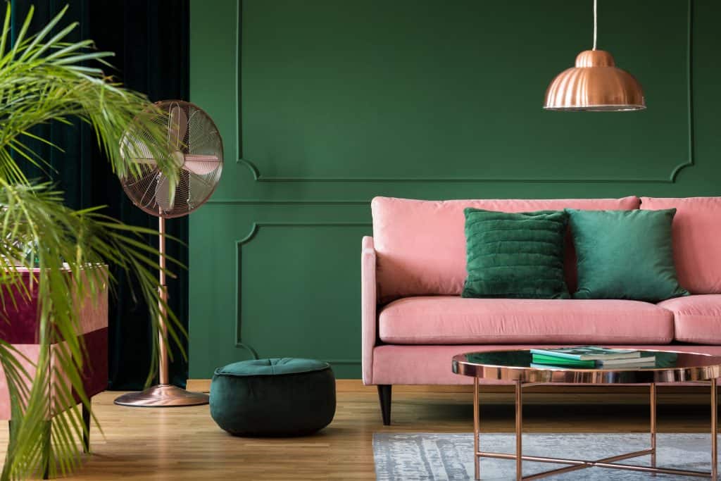
Pink and green are complimentary colors. However, if you can get a combination of pink and emerald green, you might have found one of the perfect color combinations. This is especially when dealing with household details like chandeliers and curtains. For example, having emerald green stones on a pink curtain or vice-versa brings out the royalty in your space.
6) Light Pink Accents
Light pink is a warm color that has a warm and faded feel to it. This color is not imposing and feels like a color you would go for whenever you feel like having a calm vibe. Here are some colors that can go with light pink.
a) Light Pink and Grey Blue

image source: HomeDecorBliss.com
I find this to be a perfect combination. Pink and blue are analogous on the color wheel and naturally compliment. Pink tones give off a welcoming aura, which is why it is nice to have pink pillows in your bedroom. This color combination is the closest you can get to the feeling that pastel colors give off, which is immensely satisfying.
Of all pink accents, light pink has a calm vibe, which makes grey blue the perfect match because non of the two will be fighting for attention.

image source: ApartmentTherapy.com
Using a dark grey-blue tone will still work because the shade makes the pink shade stand out more, but without being too imposing.
This is a combination you would see in a reception or a luxury commercial setting. If you are designing luxury packaging or a business card, this is a combination that you can go for. Therefore, a luxury photography set can use these colors.
The bedroom would look nice with this combination. Having light pink pillows and grey blue luxury beddings with pink throws or details in the room is one of the best interior design ideas for your bedroom. Pink is one of the best colors that match with blue.
b) Baby pink and baby blue
Baby pink can easily go with baby blue. These colors complement each other magically, and it would make sense once you see the combination. The colors bring a happy and playful vibe. If you are thinking of coloring a room for the kids, this is a perfect combination to go for.
A playroom would benefit from this because all the toys will be visible regardless of the colors. In addition, the two colors will not compete with other bright colors, nor will they be too dull for such a setting.

image source: freepik.com
This combination can be detailed with colors like yellow. For example, if you have yellow toys in a pink and blue playroom, the colors would pop nicely. This would work perfectly because blue and yellow pair perfectly.
c) Pastel Pink and Other Pastel Colors
Pastel pink falls under the light pink accents. The magical thing about pastel colors is that they can match almost perfectly and still work. Pastel pink and pastel green are one of the most beautiful things you will see.

The thing with pastel colors is that they are so timid. This implies that they can cohabit in the same space without competing with each other. Happy pastel colors evoke fleece and chalk with a smooth and cozy look. The use of pastel colors will not dull the other colors. You will meet them, but they will not demand your attention.
Choosing pastel as your color is a good choice for themed settings. For example, if your setting is a vintage theme, you can find pastel-hued accessories.
d) Blush Pinks and Blue or White
Google phone cover and tell me the dominant color you see. Blush pinks are nice to look at and create a good vibe while staying elegant. Pink is probably the most dominant color in fashion, especially on the products side. However, your space can benefit from this color combination.

image source: sunshinetips.com
Blush pink is a lovely color to pick if you plan to have wall looking elegant without taking attention away from the furniture that can be white in this case. Blush pinks tend to bring out the calmness in everyone. The color can go with white and still work perfectly.
If you have ever noticed, most packages come in this color, especially if it is a product that needs to bring out the best in you. Most shower and beauty products have this color scheme because it appeals to your quiet side.
7) Grey Pink and White, Grey or Brown
This is a color that deserves more recognition. The grey pink has a luxurious feel to it. Anyone with an outfit with this combination will have a more natural feel to the people around. The color has a weekend tennis tournament vibe or an elegant and classy picnic during summer.

Grey pink, and white color combination never goes wrong, especially in your living space. If you have white walls, you can have greyish-pink details, which will look great. Your bedroom can enjoy this combination to create a great mood for studying and sleeping. The very first thing you will experience when you wake up will affect your day positively if it is grey-pink and white, brown, or grey.

image source: elledecor.com
Large wall art with this theme is great because the piece will not impose on the eye while the wall will be catered for. You can do a lot of frames on the wall and end up with a pleasant outcome if you use this color combination.
Pink can still go with any darker shades of brown or grey without a problem. The darker the other shade, the more attractive and full of character the pink will be.
8) Pink and Muted Tones
Any earth and neutral tones will work well with the color pink. This is because pink is strategically placed in the color wheel to match almost any color. For example, pink can fall right between blue and red while staying opposite yellow as a complementary color. This does pink work well with almost all the neutral colors.

image source: home-designing.com
One thing that interior design does is find simple, practical, yet elegant solutions. Neutral colors are an interior designer's playground, and pink is one way to go about such tones. Pink is classy, especially when combined with muted tones.
9) Hot Pink and Black
Hot pink has a strong feel and can be difficult to match with other colors like white. However, hot pink is a vibrant pink and should be allowed to show off and be free. The best color to match this kind of pink would be black color.
Have you seen how elegant neon colors look? The thing that enhances such colors is the dark background. For example, it would look nice if you had a hot pink wall with black leather details. You can easily combine hot pink with shiny black backgrounds, and you will be surprised by what you end up with.

image source: DigsDigs.com
While blue is considered masculine and pink feminine, this is a shade of pink that can be shared comfortably by all genders.
While pink has a lot of forgiving hues, that can not be said about hot pink. This is a shade of pink that should be let to shine in the palette you decide to go with. Black is the best partner you can accord this color because of the lovely contrast you will achieve.
10) Soft Pink and Blue/Black/Brown
If you are a suit person, then you are familiar with the fact that among the shades of shirt that you are encouraged to have is soft pink. We recommend this colorway for all the suit combos you have. The same is true when it comes to wall and furniture pieces.

image source: BlowingIdeas.com
Soft pink is the opposite of hot pink in many aspects because it will not pop, but you will feel its presence. You see this color but do not notice it when combined correctly. There are very few colors that can achieve this.
This pink is not too bright to be distracting, but neither does it have a dull look. This is the color you can style for a party or a wedding because it will not call too much attention to the room while keeping it stylish for the occasion.
11) Pink and Gold
This is a color scheme that not many people think of. However, think of the perfect combination for your gift packaging and cards. Pink with golden glitter will look dazzling, and you can have a bold yet welcoming look. Another situation where you would use this combination is in events like indoor or outdoor weddings or parties. Getting golden Pink balloons with pink details will work nicely.

image source: insideweddings.com
If you try this combination, ensure the golden hue is shiny not to kill the warmth that pink brings. If you use a dull golden yellow, you might take from pink and end up making it boring. With this combination, you need a bright look and can not hold back on the gold.
12) Pink and Its Other Shades

image source: homedit.com
While matching colors, you do not have to go across the color wheel or too far from the color pink. Remember, pink and blue or pink and red are blood relatives. Therefore, pink will always look good, as with colors like purple, which is a mixture of blue and red. You can mix these colors by having one color as the base color and the other as patterns to detail the design. You are never going wrong with this color combination.
For instance, pink is a color that goes with red or blue, which are colors on either of its sides on the color wheel.
Final Thoughts

image source: Play-Crafts.com
Whether you want pink that pops or ambient one, you can find color combinations that meet your objective. Color is contextual to the extent that you will see some colors wrongly because of the color they are put against. Therefore, the color you combine with another color directly affects how you perceive both colors. Therefore, be very intentional with the colors you combine with pink.

